Getting and Reading Data for Today's Class
Overview
Teaching: 20 min
Exercises: 5 minQuestions
How do I find and read in the data for today’s class?
What is an xarray.Dataset?
Objectives
Discern DataArrays from Datasets in xarray
Getting Started
- Launch a Jupyter notebook on Hopper. As a reminder, its best to launch it from your home directory, then you can get to any other directory from within your notebook.
- Be sure the environment is set to
clim_data. - Create a new notebook and save it as
Subsetting.ipynb. - Import the standard set of packages we use:
import xarray as xr
import numpy as np
import cartopy.crs as ccrs
import matplotlib.pyplot as plt
Find our Dataset
Today we will work with monthly Sea Surface Temperature (SST) data. We will use the monthly global OISST version 2 dataset:
* It is 1deg x 1deg
* Latitudes go from 89.5N to 89.5S
* It goes from Dec 1981 to Apr 2020
* It is currently located in the /home/lortizur/clim680/OISSTv2 directory
Now we will take a look at the data by opening a terminal session in JupyterLab (under the “File” tab) and looking in the directory where the data are located:
$ ls /home/lortizur/clim680/OISSTv2
lmask monthly weekly
Since we are looking for monthly data, let’s look in the monthly sub-directory. Remember, you can use the up-arrow to avoid having to re-type:
~~~
$ ls /home/lortizur/clim680/OISSTv2/monthly
~~~
sst.mnmean.nc
Quick look at Metadata for our Dataset
What command can you use to look at the metadata for our dataset?
Solution
ncks -M /home/lortizur/clim680/monthly/sst.mnmean.ncBut remember to load the NCO module first (if you have not already added it to your
.bashrcfile to load it automatically), so that you will have access to the commands in the NCO library:module load nco ncks -M /home/lortizur/clim680/OISSTv2/monthly/sst.mnmean.nc
We can now use cut and paste to put the file and directory information into our notebook and read our dataset using xarray
file = '/home/lortizur/clim680/OISSTv2/monthly/sst.mnmean.nc'
ds = xr.open_dataset(file)
ds
When we run our cells, we get output that looks exactly like the results from ncks -M
It tells us that we have an xarray.Dataset and gives us all the metadata associated with our data.
What is an xarray.Dataset?
In climate data analysis, we typically work with multidimensional data. By multidimensional data (also often called N-dimensional), we mean data with many independent dimensions or axes. For example, we might represent Earth’s surface temperature T as a three dimensional variable:
T(x,y,t)
where x is longitude, y is latitude, and t is time.
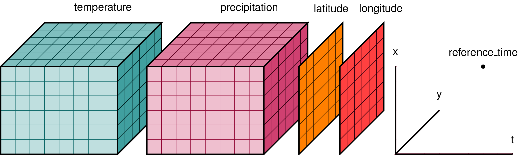
Xarray has two data structures:
* a DataArray, which holds a single multi-dimensional variable (or ‘grid’) and its coordinates
* a Dataset, which can hold multiple variables (DataArrays) that share some or all of the same coordinates
When we read in our data using xr.open_dataset, we read it in as an xr.Dataset object containing one or more DataArrays.
A DataArray contains:
* values: a numpy.ndarray holdy the array’s values (usually 1 or more dimensions)
* dims: dimension names for each axis (e.g. lon,lat,lev,time)
* coords: a container of arrays that label each point
* attrs: a container of arbitrary metadata
If we access an individual variable within an xarray.Dataset object, we have an xarray.DataArray object. Here’s an example:
ds['sst']
you will also see this syntax used
ds.sst
The latter is a little less flexible - it is harder to specify DataArray names as variables, and may fail if there are special characters in the name. The ds['sst'] construct is more robust.
Compare the output for the DataArray and the Dataset
We can access individual attribues attrs of our Dataset using the following syntax:
units = ds['sst'].attrs['units']
print(units)
Using
xarray.Dataset.attrsto label figuresGiven the following lines of code, how would you use
attrsto add units to the colorbar and a title to the map based on theunitsandlong_nameattributes?plt.contourf(ds['sst'][0,:,:]) plt.title(FILLINLONGNAMEHERE) plt.colorbar(label=FILLINUNITSHERE)
The xarray package provides many convenient functions and tools for working with N-dimensional datasets. We will learn some of them today.
Key Points
A Dataset may contain one or more DataArrays
Subsetting Data
Overview
Teaching: 30 min
Exercises: 5 minQuestions
How do I extract a particular region from my data?
How do I extract a specific time slice from my data?
Objectives
Become familiar with subsetting multidimensional data.
Subsetting data in Space
Often in our research, we want to look at a specific region defined by a set of latitudes and longitudes.
Conventional approach
We would have an array, like an numpy.ndarray with 3 dimensions, such as lat,lon,time that contains our data. We would need to write nested loops with if statements to find the indices of the latitudes and longitudes we are looking for and then extract out those data to a new array.
This is slow, and has the potential for mistakes if we get the wrong indices. Our data and metadata are disconnected.
xarray makes it possible for us to keep our data and metadata connected and select data based on the dimensions, so we can tell it to extract a specific lat-lon point or select a specific range of lats and lons using the sel function. This is a very powerful feature of xarray, the ability to parse large datasets efficiently.
Select a point
Let’s try it for a point. We will pick a latitude and longitude in the middle of the Pacific Ocean.
ds_point = ds.sel(lat=[0],lon=[180],method='nearest')
ds_point
The .sel method is for selecting data by dimesion names and/or index labels.
We can use it to slice out a set of rows and/or columns from a DataArray -
here we are selecting only one point, but we still put the values
(of latitude and longitude) into lists; lists of one element each.
There are multiple ways of selecting subsets of data in xarray - see
the online documentation
for a thorough discussion with examples.
Note that this Dataset has two data variables - the one we are interested in is sst.
xarray allows you to apply many methods to entire Datasets that other programming languages would only permit on individual DataArrays.
This is a powerful feature, but can be confusing - always think about the scope of any operation in Python when you apply it.
We could apply sel only to the sst DataArray instead of the entire Dataset:
da_point = ds['sst'].sel(lat=[0],lon=[180],method='nearest')
da_point
We now see that the result da_point is a xarray.DataArray, not a xarray.Dataset, and it has one dimension: time.
This operation is more efficient. If we had a very large Dataset but were only interested in the values from one DataArray, it would be wasteful to perform this subsetting on all the variables.
The numpy function array_equal tests if two arrays have exactly the same dimensions and contents.
np.array_equal(da_point,ds_point['sst'])
You can see that the result of the test is true - the two appraches yield the same final result.
Plotting a time series
We now have a new xarray.Dataset with all the times and a single latitude and longitude point. All the metadata is carried around with our new Dataset. We can plot this timeseries and label the x-axis with the time information.
plt.plot(da_point)
Note the X-axis simply counts the 461 time steps.
This is not very informative if we would like to know when a particular spike occurred.
When plt.plot is given one series, it is assumed to be the values on the Y axis and the X axis is simply counted as the element number in the seroes.
We can give it two series - the first is then the values for the X-axis:
plt.plot(da_point['time'],da_point)
For matplotlib.pyplot, it is good to consult the documentation,
not just to learn the syntax for using a specific function, but also to see the possibilities that you may try.
There are a lot of creative options that you may not have considered originally.
Select a Region
A common region to look at SSTs is the Niño3.4 region. It is defined as 5S-5N; 170W-120W.
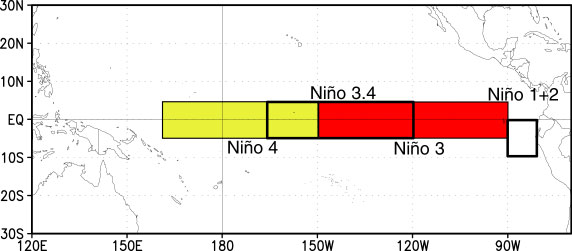
Our longitudes are defined by 0 to 360 (as opposed to -180 to 180), so we need to specify our longitudes consistent with that. To select a region we use the sel command with slice
ds_nino34 = ds['sst'].sel(lon=slice(360-170,360-120),lat=slice(-5,5))
ds_nino34
Notice that we have no latitudes, what happened?
Our data has latitudes going from North to South, but we sliced from South to North. This results in sel finding no latitudes in the range. There are two options to fix this: (1) we can slice in the direction of the latitudes lat=slice(5,-5) or (2) we can reverse the latitudes to go from South to North.
Let’s reverse the latitudes.
ds = ds.reindex(lat=list(reversed(ds['lat'])))
This line reverses the latitudes and then tells xarray to put them back into the latitude coordinate. But, since xarray keeps our metadata attached to our data, we can’t just reverse the latitudes without telling xarray that we want it to attach the reversed latitudes to our data instead of the original latitudes. That’s what the reindex function does.
Now we can slice our data from 5S to 5N:
ds_nino34 = ds['sst'].sel(lon=slice(360-170,360-120),lat=slice(-5,5))
ds_nino34
Now, let’s plot our data:
plt.contourf(ds_nino34['lon'],ds_nino34['lat'],
             ds_nino34[0,:,:],cmap='RdBu_r')
plt.colorbar()
Note that the plot fills the available area - it is not in the shape of the actual Niño3.4 region but has been stretched along the Y-axis. There are ways to control plot shapes and positions - we will talk about them later in the course.
Also, there are many options for colormaps. See this page for inspiration.
Time Slicing
Sometimes we want to get a particular time slice from our data. Perhaps we have two datasets and we want to select the time slice that is common to both. In this dataset, the data start in Dec 1981 and end in Apr 2020. Suppose we want to extract the times for which we have full years (e.g, Jan 1982 to Dec 2019. We can use the sel function to also select time slices. Let’s select only these times for our ds_nino34 dataset.
ds_nino34 = ds_nino34.sel(time=slice('1982-01-01','2019-12-01'))
ds_nino34
Writing data to a file
In this case the dataset is small, but saving off our intermediate datasets is a common step in climate data analysis. This is because our datasets can be very large so we may not want to wait for all our analysis steps to run each time we want to work with this data. We can write out our intermediate data to a file for future use.
It is easy to write an
xarray.Datasetto a netcdf file using theto_netcdf()function.Write out the ds_nino34 dataset to a file in your /scratch directory, like this (replace my username with yours):
ds_nino34.to_netcdf('/scratch/YOUR_USERID/nino34_1982-2019.oisstv2.nc')Bring up a terminal window in Jupyter and convince yourself that the file was written and the metatdata is what you expect by using
ncks -M
Key Points
Saving intermediate datasets to disk is a good way to break large data analysis tasks into manageable, repeatable steps.
Aggregating Data
Overview
Teaching: 20 min
Exercises: 15 minQuestions
How to I aggregate data over various dimensions?
Objectives
Lean how to apply aggregating functions across multidimensional DataArrays which, in other languages, would require looping.
The Oceanic Niño Index ONI is used by the Climate Prediction Center to monitor and predict El Niño and La Niña. It is defined as the 3-month running mean of SST anomalies in the Niño3.4 region. We will use aggregation methods from xarray to calculate this index.
First Steps
Create a new notebook and save it as Agg_Mask_Interp.ipynb
Import the standard set of packages we use:
import xarray as xr
import numpy as np
import cartopy.crs as ccrs
import matplotlib.pyplot as plt
Change the next cell from code to markdown and add a title for this episode:
## Aggregation
Read in the dataset we wrote in the last notebook.
file='/scratch/[your_userid]/nino34_1982-2019.oisstv2.nc'
ds=xr.open_dataset(file)
ds
Take the mean over a lat-lon region
ds_nino34_index = ds.mean(dim=['lat','lon'])
ds_nino34_index
Our data now has only a time dimension. Make a plot.
plt.plot(ds_nino34_index['time'],ds_nino34_index['sst'])
Take the weighted mean over a lat-lon region
When performing a spatial average of data on a lat-lon grid we need to take into account the fact that the area of each grid cell is not the same because lines of longitude converge as they approach the poles. This convergence leads to a decrease in delta x (east-west distance in m) following the cosin of latitude, and therefore grid cell area (delta x * delta y). One must therefore perform an area weighted average = sum(var * weights) / sum(weights) where the weights are proportional to the area of each grid cell i.e. the cosin of latitude
Xarray has some build in funtionality to assist in calculating this weighted area average. First you will need to create a “weights” array proportional to cosine of latitude, this is the area-weighting factor for data on a regular lat-lon grid.
weights = np.cos(np.deg2rad(ds.lat))
weights.dims
We see that the weights variable has the dimensions of latitude.
plt.plot(ds.lat,weights)
Let’s evaluate the impact of multiplying our SST feild by these weights.
weighted_sst = ds.sst * weights
plt.plot(ds.lat,weighted_sst[0,:,0])
plt.plot(ds.lat,ds.sst[0,:,0])
This weighting leads to small difference because of our small tropical domain, but would be more important if calucalting an domain average over a larger region or closer to the poles.
Next let’s use Xarray’s build in fuctionality for weighted reductions. It create a special intermediate DataArrayWeighted object, to which different reduction operations can applied - https://xarray-contrib.github.io/xarray-tutorial/scipy-tutorial/03_computation_with_xarray.html
sst_weighted = ds.sst.weighted(weights)
sst_weighted
Now let’s use this to calculate the area weighted mean
ds_nino34_index_weighted = sst_weighted.mean(dim=("lon", "lat"))
Because we are in a small tropical domain this makes a very small difference, but is very important when taking the gloabl mean of a feild for example.
plt.plot(ds_nino34_index['time'],ds_nino34_index['sst'])
plt.plot(ds_nino34_index_weighted['time'],ds_nino34_index_weighted)
Calculate Anomalies
An anomaly is a departure from normal (i.e., the climatology). We often calculate anomalies for working with climate data.
Change the next cell from code to markdown and add a title for this section:
### Anomalies
We will spend time in a future class learning about calculating climatology and anomalies using another feature of xarray called groupby.
For now we will proceed with little explanation - but you may intuit that in the code below, we are grouping by month.
In other words, we are calculating the mean SST for each month and ending up with a climatology whose time dimension is only 12 months:
ds_climo = ds_nino34_index.groupby('time.month').mean()
ds_climo
plt.plot(ds_climo.month,ds_climo.sst)
Below we calculate anomalies by subtracting the climatology from the original time series:
ds_anoms = ds_nino34_index.groupby('time.month')-ds_climo
ds_anoms
Plot our data.
plt.plot(ds_anoms['time'],ds_anoms['sst'])
Why are we constantly printing and ploting the data?
Printing the data is a way to see its dimensions after each step. It provides a check on whether your code did what you intended it to do. You can often catch and fix problems early this way.
Plotting also provides a quick check to make sure everything looks reasonable.
We encourage you to do the same checking along the way when developing and testing new code!
Rolling (Running Means)
The ONI is calculated using a 3-month running mean. This can be done using the rolling method.
Reading and Learning from Documentation
Read the documentation for the
xarray.rollingmethod. Following their example, make a 3-month running mean of theds_anomsdata.Solution
ds_3m = ds_anoms.rolling(time=3,center=True).mean().dropna(dim='time')
ds_3m
Note the time dimension and coordinates of
ds_3mand compare to the time dimension ofds_anoms. What has happened?Solution
The centered 3-month running mean cannot calculate a value for the first and last time steps. Those had been set to
NaN(not a number) and we clipped those off with the.dropna()Thus,ds_3mis two months shorter thands_anoms, starting in February 1982 and ending with November 2019.
Let’s plot our original and 3-month running mean data together
plt.plot(ds_anoms['time'],ds_anoms['sst'],color='r')
plt.plot(ds_3m['time'],ds_3m['sst'],color='b')
plt.legend(['original','ONI'])
Note that the plotting was not confused by the fact that the two time series were of different lengths.
Because we specified the time coordinate of each as its X-axis values, plt.plot could navigate the data and plot it correctly.
Some other aggregation functions
There are a number of other aggregate functions such as:
std,min,max,sum, among others.Using the original dataset in this notebook
ds, find and plot the maximum SSTs for each gridpoint over the time dimension.Solution
ds_max = ds.max(dim='time')
plt.contourf(ds.lon,ds.lat,ds_max['sst'],cmap='Reds_r')
plt.colorbar()
Using the original dataset in this notebook
ds, calculate and plot the standard deviation at each gridpoint.Solution
ds_std = ds.std(dim='time')
plt.contourf(ds.lon,ds.lat,ds_std['sst'],cmap='YlGnBu_r')
plt.colorbar()
Key Points
Aggregation functions are used often in climate data analysis, and are made easy with xarray
Masking
Overview
Teaching: 20 min
Exercises: 0 minQuestions
How to I maskout land or ocean?
Objectives
Understand how to apply masks to limit the domain where calcuations or plotting occurs.
Sometimes we want to maskout certain data, for instance, based on a land/sea mask that is provided. The OISST dataset we have been using oddly shows data over land too - how could that be SST?
Let’s create a notebook named Masking.ipynb and add our standard set of import statements to the first code cell:
import xarray as xr
import numpy as np
import cartopy.crs as ccrs
import matplotlib.pyplot as plt
Create a new markdown cell for this episode:
## Masking
Read in this dataset:
obs_file = '/home/lortizur/clim680/OISSTv2/monthly/sst.mnmean.nc'
ds_obs = xr.open_dataset(obs_file)
ds_obs
This is the original SST data file we read in last time. Let’s plot the time mean again here, so we remember how it looks.
plt.contourf(ds_obs.lon,ds_obs.lat,ds_obs['sst'].mean('time'),cmap='coolwarm')
plt.colorbar()
Next let’s read in a second file.
mask_file = '/home/lortizur/clim680/OISSTv2/lmask/lsmask.nc'
ds_mask = xr.open_dataset(mask_file)
ds_mask
Let’s look at this second file. It contains a lat-lon grid that is the same as our SST data, but a single time. The data are 0’s and 1’s. Plot it.
plt.contourf(ds_mask['mask'])
What does this error mean?
The data has a degenerate time dimension with a single element and coordinate so the array appears as 3-D to the plotting function.
We can drop any singular dimensions like this using the squeeze method:
ds_mask = ds_mask.squeeze()
plt.pcolormesh(ds_mask['mask'])
We have used a different plotting function.
* countourf plotted a discrete set of colors at contour intervals along smooth curves.
* pcolormesh plots filled grid cells matching the resolution of the data, but using a more continuous color scale.
The latitudes are upside down. We could fix that like we did before. However, if we use the latitudes as the Y-coordinate parameter, it will reorient the plot automatically:
plt.pcolormesh(ds_mask.lon,ds_mask.lat,ds_mask['mask'])
plt.colorbar()
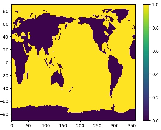
That’s better! We can see that the mask data are 1 for ocean and 0 for land.
We can use the where method in xarray to mask the data to only over the ocean.
da_ocean = ds_obs['sst'].mean('time').where(ds_mask['mask']==1)

ax = plt.axes(projection=ccrs.PlateCarree())
cs = ax.pcolormesh(da_ocean.lon,da_ocean.lat,da_ocean,cmap='coolwarm',
                 transform = ccrs.PlateCarree())
cbar = plt.colorbar(cs,orientation='horizontal',label='Mean SST (˚C)')
ax.coastlines()
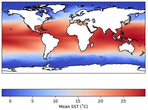
Recall that we could have achieved the same blanking out of the land areas by using the feature
interface in cartopy to paint over the temperature values over the continents.
But those land values are still there in the array.
There are often instances where we truly want to remove data from an array using a mask, like we did above over land. Let’s calculate a time series of global SST that only includes the ocean grid cells, none of the data over land. Furthermore, let’s apply area weighting like we showed previously:
weights = np.cos(np.deg2rad(ds_mask.lat))
unmasked = ds_obs['sst'].weighted(weights).mean(dim=['lon','lat'])
masked = ds_obs['sst'].where(ds_mask['mask']==1).weighted(weights).mean(dim=['lon','lat'])
We have also calculated an unmasked version of the time series for comparison.
Notice a couple of things about the cell above:
1. We have chained together multiple operations as a string of methods - they are executed in order from left to right on each line.
2. We had to apply the masking operation (the where method) before we generated the
weighted array object with the weighted method - the sequence of operations often matters and
will produce an error or the wrong result if not applied in the correct (logical) sequence.
Think carefully about what makes sense when you are doing complex calculations.
Let’s plot the results:
plt.plot(masked.time,masked,label='Land masked out')
plt.plot(unmasked.time,unmasked,label='No mask applied')
plt.title('Global mean OI SST')
plt.ylabel('Degrees Celsius')
plt.legend()
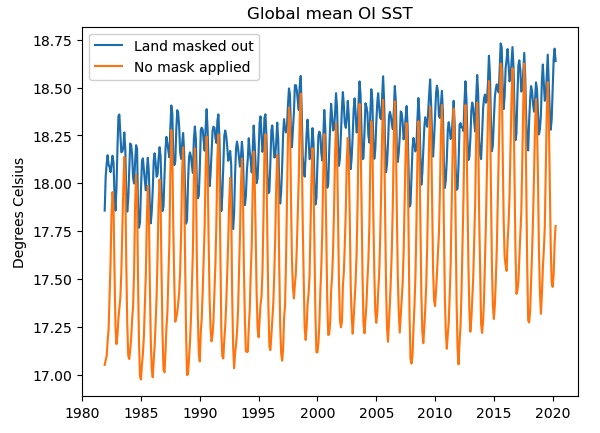
If we do not mask out the land points (orange curve), the seasonal cycle is much stronger and there is a cold bias, probably due to the inclusion of the large high-latitude land areas of Antarctica, Eurasia and North America. Only the blue curve shows the true “SST” global mean.
We also used some other features in plotting: specifying a label for each instance of plt.plot allows us
to generate the legend automatically. Also, we have labeled the Y-axis and applied a title to our plot.
Finding help for
xarrayThe
xarraydocumentation is also worth bookmarking. Keep in mind that in Python there is usually a very simple and straightforward function or library that will do anything you want to do. Often the trick is discovering the right function! Web searches can be very helpful.In particular, most questions you might have are already answered by someone on Stack Overflow, which is an open forum for programming questions and answers. However, the quality of the answers varies - always try to understand any appropriate-looking answer before relying on it. Use Stack Overflow and other online resources as learning tools, not a crutch!
Key Points
Masking is another powerful tool for working with data.
pcolormeshplots data as a grid of color shades corresponding to the data’s grid
Interpolating
Overview
Teaching: 35 min
Exercises: 5 minQuestions
How do I interpolate data to a different grid?
Objectives
Learn how to compare and inspect datasets.
It is common in climate data analysis to need to interpolate data to a different grid. One example is that I have model data on a model grid and observed data on a different grid. I want to calculate a difference between model and obs.
In this lesson, We will make a difference between the average SST in a CMIP5 model historical simulation and the average observed SSTs from the OISSTv2 dataset we have been working with.
Regular Grid
If you are using a regular grid, interpolation is easy using xarray.
A regular grid is one with a 1-dimensional latitude and 1-dimensional longitude. This means that the latitudes are the same for all longitudes and the longitudes are the same for all latitudes. This does not mean the spacing of either grid needs to be uniform! Global climate model output, in particular, is often non-uniform in latitude. This is not a problem for xarray.
Most of the data you encounter will be on a regular grid, but some are not. We will discuss irregular grids later in the course.
In a new markdown cell, create a new header for this episode:
## Interpolating
Read in some model data
model_path = '/home/pdirmeye/classes/clim680_2022/CCCma.CanCM4/'
model_file = 'ts_Amon_CanCM4_historical_r1i1p1_196101-200512.nc'
ds_model = xr.open_dataset(model_path+model_file)
ds_model
This data has latitudes from S to N, so we don’t need to reverse it.
Take a look at our model data.
It is much lower resolution that the observations we have been using - there are only 64 points in latitude, 128 in longitude.
Also, this data appears to have different units than the obs data. We can change this.
ds_model['ts'] = ds_model['ts'] - 273.15
ds_model['ts'].attrs['units'] = ds_obs['sst'].attrs['units']
ds_model['ts']
Remember that xarray keeps our metadata with our data, so we also had to change the units metadata to keep that information correct in our xarray.Dataset
How would you take the time mean of each dataset?
ds_obs_mean = ds_obs.mean(dim='time')
ds_model_mean = ds_model.mean(dim='time')
ds_model_mean
We are now going to use the interp_like function. The
documentation
tells us that this fucntion interpolates an object onto the coordinates of another object, filling out of range values with NaN.
One important thing to know that is not clear in the documentation is that the coordinates and variable name to interpolate must all be the same.
All variables in the Dataset that have the same name as the one we are interpolating to will be interpolated.
Both of our datasets use lat and lon, but the model dataset uses ts (because it is actually surface temperature over all surfaces) and the obs dataset uses sst.
Let’s change the name of the model variable to sst.
ds_model_mean = ds_model_mean.rename({'ts':'sst'})
We will interpolate the model to match the obs.
model_interp = ds_model_mean.interp_like(ds_obs_mean)
model_interp
Let’s take a look and compare with our data before interpolation.
We will make use of cartopy again to make more pleasing figures.
fig = plt.figure(figsize=(11,8.5))

ax = plt.axes(projection=ccrs.PlateCarree(central_longitude=180.0))

cs = ax.pcolormesh(ds_model_mean['lon'],ds_model_mean['lat'],
                   ds_model_mean['sst'],cmap='coolwarm',transform=ccrs.PlateCarree())
ax.coastlines()
plt.title('Original')
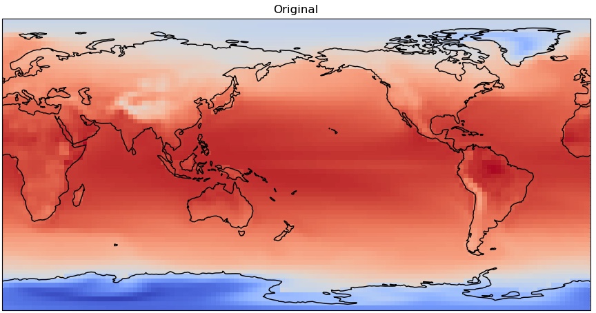
fig = plt.figure(figsize=(11,8.5))

ax = plt.axes(projection=ccrs.PlateCarree(central_longitude=180.0))

cs = ax.pcolormesh(model_interp['lon'],model_interp['lat'],
                   model_interp['sst'],cmap='coolwarm',transform=ccrs.PlateCarree())
ax.coastlines()
plt.title('Interpolated')
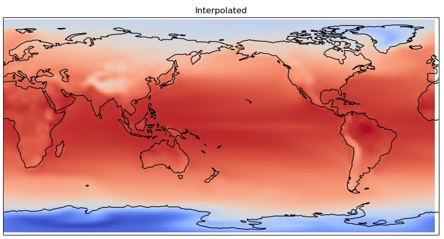
You can clearly see the coarser pixelation in the original grid, as it is lower resolution.
Now let’s see how different our model mean is from the obs mean. Remember to apply our land/ocean mask this time as we are only concerned with SST.
diff = (model_interp-ds_obs_mean).where(ds_mask['mask']==1)
diff
And plot it…
from matplotlib.colors import CenteredNorm
fig = plt.figure(figsize=(11,7))

plt.pcolormesh(diff.lon,diff.lat,diff['sst'], cmap='coolwarm', norm=CenteredNorm(0))
plt.colorbar(label='˚C')
plt.title('Model minus OBS')
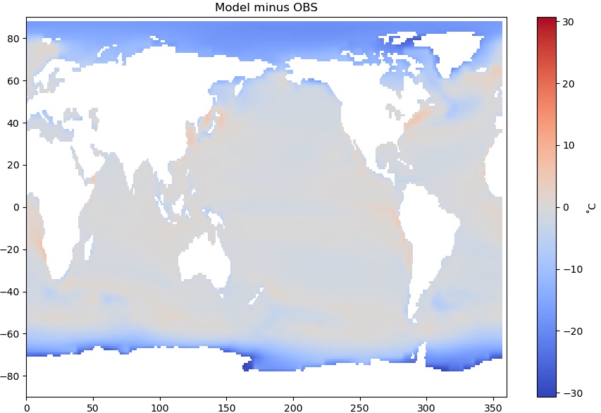
A critical eye toward your results
Does this difference map look OK? A little stange? Maybe even alarming?
There are very large differences at high latitudes - the model is as much as 30˚C colder than observations. What is going on?
Solution
Recall that the model variable is not actually SST but surface temperature. The dark blue areas are where sea ice is present. In the model output, this is the mean temperature of the top of the sea ice.
Look back at the map of the masked observational SST you produced in the Masking section of your notebook. Ocean water can get below 0˚C due to its salt content, but only a couple degrees below. In the observational dataset, it is actually the ocean temperature below the ice that is reported!
Thus we are not comparing the same quantities at high latitudes. Where there is no sea ice, this is a valid comparison.
Always be careful to consider what a result means, and why it looks the way it does!
Key Points
Interpolating different data sets to a common grid is necessary to perform quantitative comparisons or to combine data.
Don’t automatically accept your result. Scrutinize, try to understand the features you see. Do they mean what you think they should mean?