Making Maps with Cartopy
Overview
Teaching: 60 min
Exercises: 0 minQuestions
How can I use Cartopy for Climate Data Analysis
Objectives
Learn key features of Cartopy to use for Climate Data Analysis
Cartopy
cartopy is a Python map plotting package.
It was originally developed by meteorologists at the UK Met Office,
as plotting gridded model output and observational data onto easy-to-read maps is a common task in the field.
Combined with matplotlib it works well for making contour plots of maps for Climate Data Analysis
This lesson will demonstrate how to make contour plots using cartopy.
Plotting Gridded Data
We will use CMIP5 data for surface air temperature (tas) from the RCP8.5 scenario produced by the NCAR/CCSM4 model. For this example, we will use only the first ensemble member.
The data are located in the following directory on Hopper: /home/lortizur/clim680/cartopy_data/
The filename is: tas_Amon_CCSM4_rcp45_r1i1p1_210101-229912.nc
In a new Jupyter notebook (call it cartopy_test.ipynb) type into the code cell:
import numpy as np
import xarray as xr
import matplotlib.pyplot as plt

import cartopy.crs as ccrs
import cartopy.mpl.ticker as cticker
import cartopy.feature as feature
from cartopy.util import add_cyclic_point
Because you are only reading the dataset, not editing or changing it, and it resides on the same computing system where you are running your Jupyter notebook, you do not need to copy it to your directory. Instead, we will give the path to the dataset.
In a new code cell, type:
path = '/home/lortizur/clim680/cartopy_data/'
fname = 'tas_Amon_CCSM4_rcp45_r1i1p1_210101-229912.nc'
ds = xr.open_dataset(path+fname)
ds
You should see a display of the contents of the file, including metadata.
Note we did not use the print statement to display ds.
This is a shortcut that works only if it is the last line in the cell.
Let’s take the mean temperature over the entire period for our plots
ds_mean=ds.mean(dim='time')
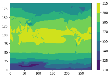
If we just use plt.contourf from matplotlib, we get this:
plt.contourf(ds_mean['tas'])
plt.colorbar()
;
Plot with a map
However, we would like to plot this with map and control the side, the map projection, label the lats and lons, etc.
# Make the figure larger
fig = plt.figure(figsize=(11,8.5))

# Set the axes using the specified map projection
ax=plt.axes(projection=ccrs.PlateCarree())

# Make a filled contour plot
ax.contourf(ds['lon'], ds['lat'], ds_mean['tas'],
            transform = ccrs.PlateCarree())

# Add coastlines
ax.coastlines()
;
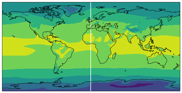
Cyclic data and lat-lon labels
This figure has a couple of things we would like to change:
- The stripe at 0 lon. This is due to the fact that
contourfhas no way to know that our data is cyclic in longitude. The fact that the Earth is round befuddles many plotting packages likematplotlib.cartopyhas a fix for this usingcartopy.util.add_cyclic_point - No labels for the latitude and longitude. We will add lat-lon labels using
set_x(y)ticksandcticker.
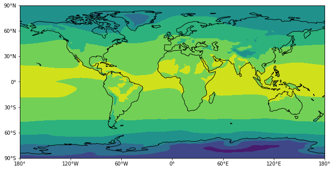
Make a copy of your cell (shortcut: click on the right side of the cell so a highlight bar appears.
Then type: c v – it will copy the cell and paste the copy below it).
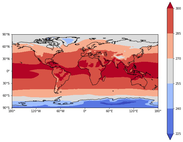
# Make the figure larger
fig = plt.figure(figsize=(11,8.5))

# Set the axes using the specified map projection
ax=plt.axes(projection=ccrs.PlateCarree())

# Add cyclic point to data
data=ds_mean['tas']
data, lons = add_cyclic_point(data, coord=ds['lon'])

# Make a filled contour plot
cs=ax.contourf(lons, ds['lat'], data,
            transform = ccrs.PlateCarree())

# Add coastlines
ax.coastlines()

# Define the xticks for longitude
ax.set_xticks(np.arange(-180,181,60), crs=ccrs.PlateCarree())
lon_formatter = cticker.LongitudeFormatter()
ax.xaxis.set_major_formatter(lon_formatter)

# Define the yticks for latitude
ax.set_yticks(np.arange(-90,91,30), crs=ccrs.PlateCarree())
lat_formatter = cticker.LatitudeFormatter()
ax.yaxis.set_major_formatter(lat_formatter)
;
The colors are not very nice for plotting temperature contours.
Let’s choose a different colormap and add a colorbar.
The colormap options
come from matplotlib.
We will choose one called coolwarm
# Make the figure larger
fig = plt.figure(figsize=(11,8.5))

# Set the axes using the specified map projection
ax=plt.axes(projection=ccrs.PlateCarree())

# Add cyclic point to data
data=ds_mean['tas']
data, lons = add_cyclic_point(data, coord=ds['lon'])

# Make a filled contour plot
cs=ax.contourf(lons, ds['lat'], data,
            transform = ccrs.PlateCarree(),cmap='coolwarm',extend='both')

# Add coastlines
ax.coastlines()

# Define the xticks for longitude
ax.set_xticks(np.arange(-180,181,60), crs=ccrs.PlateCarree())
lon_formatter = cticker.LongitudeFormatter()
ax.xaxis.set_major_formatter(lon_formatter)

# Define the yticks for latitude
ax.set_yticks(np.arange(-90,91,30), crs=ccrs.PlateCarree())
lat_formatter = cticker.LatitudeFormatter()
ax.yaxis.set_major_formatter(lat_formatter)

# Add colorbar
cbar = plt.colorbar(cs)
;
Change the map projection
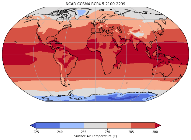
What if we want to use a different map projection? There are many map projections available. Let’s use the Robinson projection. We’ll also give the plot a title and label the colorbar:
# Make the figure larger
fig = plt.figure(figsize=(11,8.5))

# Set the axes using the specified map projection
ax=plt.axes(projection=ccrs.Robinson())

# Add cyclic point to data
data=ds_mean['tas']
data, lons = add_cyclic_point(data, coord=ds['lon'])

# Make a filled contour plot
cs=ax.contourf(lons, ds['lat'], data,
            transform = ccrs.PlateCarree(),cmap='coolwarm',extend='both')

# Add coastlines
ax.coastlines()

# Add gridlines
ax.gridlines()

# Add colorbar
cbar = plt.colorbar(cs,shrink=0.7,orientation='horizontal',label='Surface Air Temperature (K)')

# Add title
plt.title('NCAR-CCSM4 RCP4.5 2100-2299')
;
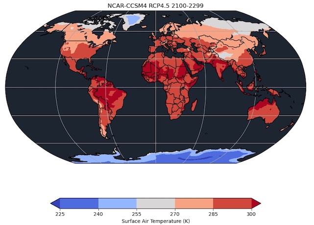
Masking
Cartopy includes landscape features that can be used to overlay our data plots.
# Make the figure larger
fig = plt.figure(figsize=(11,8.5))

# Set the axes using the specified map projection
ax=plt.axes(projection=ccrs.Robinson())

# Add cyclic point to data
data=ds_mean['tas']
data, lons = add_cyclic_point(data, coord=ds['lon'])

# Make a filled contour plot
cs=ax.contourf(lons, ds['lat'], data,
            transform = ccrs.PlateCarree(),cmap='coolwarm',extend='both')

# Mask out continents
ax.add_feature(feature.OCEAN, zorder=2, color='#1F2A38')
ax.add_feature(feature.BORDERS, zorder=2, color='k')
ax.add_feature(feature.LAKES, zorder=3, color='#1F2A38')
ax.coastlines(zorder=3, color='k')

# Add gridlines
ax.gridlines()

# Add colorbar
cbar = plt.colorbar(cs,shrink=0.7,orientation='horizontal',label='Surface Air Temperature (K)')

# Add title
plt.title('NCAR-CCSM4 RCP4.5 2100-2299')
;
Good code editing habits
One of the most frustrating things that happens when writing code is when you have a program that works, but you want to make an improvement. You change one little thing, and it stops working. Then you try to change it back, and it’s still broken because something is not exactly like it was.
You should never change working code unless you are replacing it with newer working code. If you have cell in a Jupyter notebook that does what you want, but you wish to improve it, make a copy of the cell and work on the copy until you get it as you want it. Then, delete the old cell.
Likewise for an entire working notebook, script or program. Copy the file and work on the copy. When you have a new and improved version, replace the original, or just give it a newer version number. This version numbering approach is at the heart of robust code maintenance practices. Combined with clear and complete documentation (inline comments in your code, and good use of markdown cells to describe your cells), these practices will cost you a little extra time now, but save you a lot of time later.
A good philosophy is: 1. Write all your code as if other people will read it. 2. Write all your code like your future self will depend on it!
Key Points
Cartopy supports a wide range of map projections for plotting georegistered data
Cartopy links to datasets for coastlines, political boundaries, rivers and much more, to produce attractive data maps